REDESIGN AN APP
The Challenge
I have to redesign a minimum of three screens. I’m not required to conduct any UX research. The one and only constraint was not to delete any information or add any new features.
Clone screens
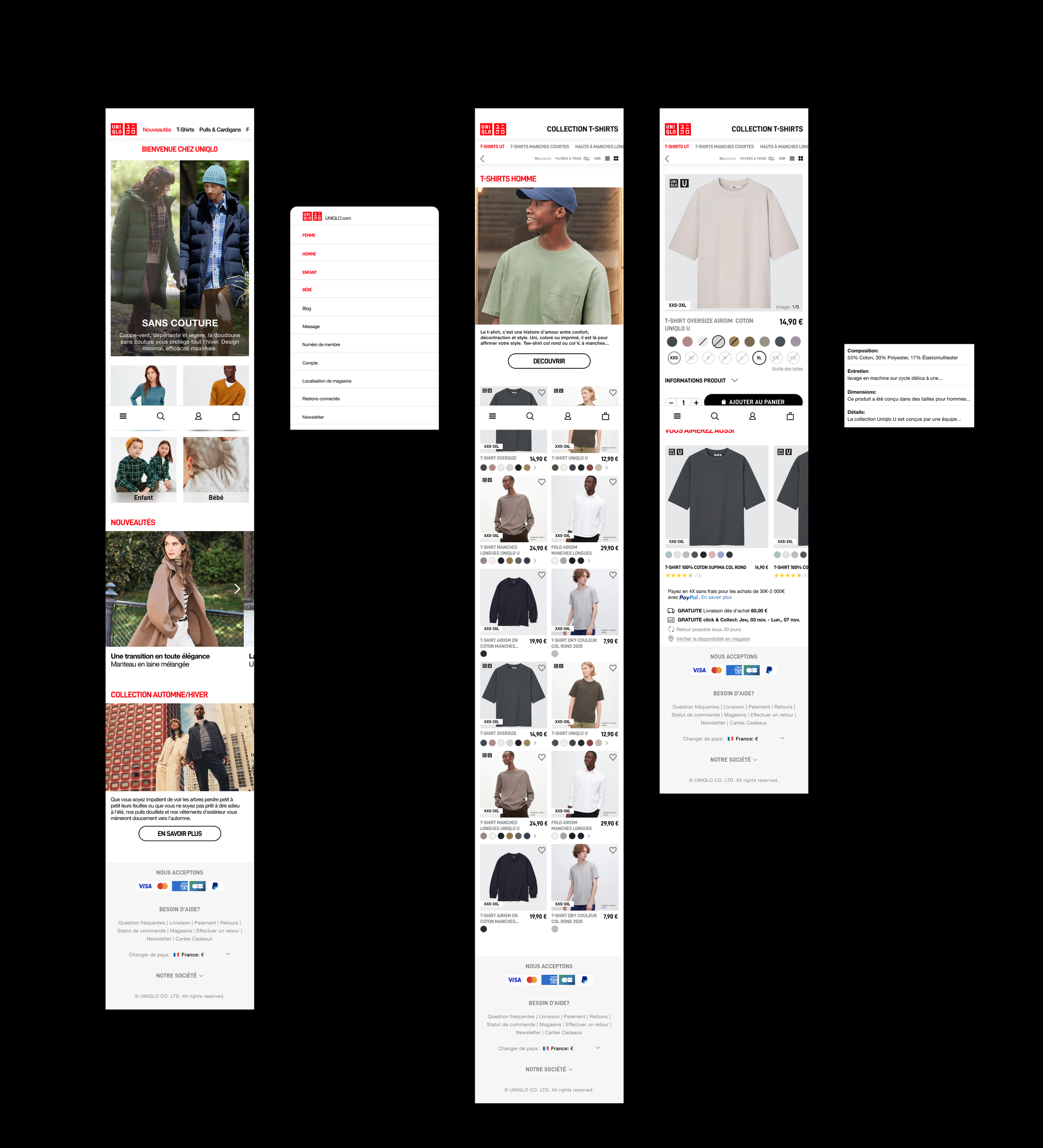
First I had to screenshots 4 screen of the Uniqlo app and reproduce them in Figma. I choosed the homepage, the overlay menu, the category page and the product page..
Heuristics Evaluation
I’m used to using this app, so I already knew the interface “problems”. So I did a heuristic evaluation* on these 4 screens.
*A heuristic evaluation is a method of inspecting the usability of a software that helps identify usability issues in user interface design.
The main problem with the Uniqlo app is that navigating through the app is not intuitive. Instead of completely redesigning the application, I decided to modify and rearrange the various menus and categories to facilitate navigation.
Style tile
I created a style tile to help me during the redesign.
Prototype
Created an home page with direct display of clothes when opening the app.
Replaced access to categories (burger menu) with a category horizontally scroll in the header.
Created a navbar with “menu”, “ search”, “profile” and “cart” fonctions.
Created a menu with direct access to categories (man, woman, children, baby) and other functions (blog, message…).
Simplify product information as much as possible (composition, details, colors choice…).
Final Prototype
Conclusion
For me, the main objective of this challenge was not to necessarily completely redesign the application but rather to understand where the problems are and fix them.


